Responsiveness and Mobile Friendliness
We almost thought about putting this section at the very top. Not only is mobile friendliness now a Google ranking factor, Google has actually created a mobile algorithm to help rank websites within their mobile search results.
Before we go any further we should really clarify two basic definitions:
- mobile-friendly – In the context of SEO, mobile friendly means a page renders well on a phone: text is readable without zooming, tap targets are far enough apart, content fits the viewport, and nothing obvious is broken on a small screen
- responsive design / responsive – A responsive website is a type of web development that enables websites to be mobile friendly by “responding” to the device the user is using.
In a traditional “mobile” website the web developer creates two websites: a mobile version, and a desktop version. The mobile version is a completely different version of the main website, and many times is even given its own subdomain or URL:

Our personal recommendation is to use a responsive website. With a responsive website your website will be readable on practically any device, while “mobile-friendly” websites have a reputation for breaking on devices with odd-sized screens.
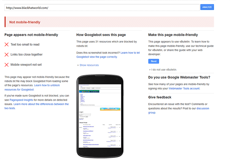
While some of our on-page recommendations might be debatable, having a mobile-friendly or responsive website is mandatory for any site wanting to do SEO. Google retired the standalone Mobile-Friendly Test and the Mobile Usability report in Search Console back in December 2023. Today you check mobile rendering with Search Console’s URL Inspection tool (it renders the page as Googlebot sees it on a smartphone) plus PageSpeed Insights, which reports the mobile Core Web Vitals and flags layout and interaction issues. Both tools will also surface any blocked JavaScript or CSS resources that are tripping Googlebot up

The usual mobile failure modes boil down to a short list: text too small to read, tap targets too close together, content wider than the viewport, or the viewport meta tag being missing or wrong. Some are a one-line CSS fix; others mean reworking a whole template.
Mobile Algorithm Update
In early 2015, Google released the mobile algorithm update that rewarded websites for being responsive and mobile friendly. Google outright stated that they were going to start giving preferential treatment to websites that are mobile friendly, or responsive. The mobile algorithm update applies to individual pages within websites, not the entire website itself. So for example if your entire website is mobile friendly but one page is not, that one “unoptimized” page will be the only one that is affected, all other pages will be fine. Being that now that mobile traffic has exceeded desktop traffic in general, this is a change that many SEO’s predicted would happen for a long time.
Our agency website saw a nice boost during this update. Rarely do we see boosts in search engine traffic from this type of update but in this case, it happened. This is one reason why we focus so much on a website being mobile friendly responsive when we build websites in-house. It is such an easy win in terms of bringing in new search engine traffic, it is difficult to ignore.
Older, mobile only results caused a number of problems for websites serving up the same version of content, linking to web versions from the mobile version and not working on certain devices such as Android tablets. This is why we recommend using responsive websites instead of mobile versions.
At the time the 2015 “Mobilegeddon” update only affected mobile rankings, but that has changed. Google finished rolling out mobile-first indexing to every site by July 2024, which means Google now crawls and indexes the mobile version of your pages as the primary version. A site that renders badly on mobile can hurt your rankings in every search, not just on a phone.
Responsive is Much Easier to Deal With
How does responsive website design work?
In a traditional desktop vs mobile scenario, there are 2 versions of the website or sometimes 3:
- a desktop version for computer monitors generally greater than 14″
- a mobile version for Android and iPhone sized phones
- and sometimes a tablet version
This was really fine for a while right around the sweet spot of 2010-2013 when life was simple and there were only a few sizes of phones. 2013 popped off and the floodgates of mobile screen sizes started pouring in. No longer were there 3-4 sizes of screens, it was more like 3-400 sizes of screens.

Web developers couldn’t keep up and soon mobile websites were “broken,” not working or serving up the wrong version for the wrong device. At this point responsive web design was popular, but it was a close tie with mobile websites. By the start of 2015 the debate was finally over: responsive web design for all. Yes there are still some mobile websites out there but for the most part web developers and SEO’s choose responsive web design.
With responsive web design, you no longer have to worry about if your device will fit a certain screen size. Instead of building a website to fit the device, the website itself “responds” to the size of the device. So it doesn’t matter if it is a 1″x 1″ screen on an Apple Watch, a brand new iPad, or a gigantic big screen TV.

Sure, some responsive frameworks are better than others. Bootstrap (originally built at Twitter and now maintained as an independent open-source project) is still one of the most widely used, and modern alternatives like Tailwind CSS and framework-native systems (Next.js, Astro, etc.) handle responsive layout out of the box. Whatever you pick, the point is the same: the page responds to the device.
Common Pitfalls with Mobile SEO
If you’ve gotten this far and have a responsive or mobile friendly website, congratulations. With that in mind there are still some common mistakes to avoid. One of the most common mistakes we see is webmasters blocking JavaScript or CSS. A lot of the times this is accidental, other times it is done intentionally.
Treat your mobile or responsive website exactly as you would a normal website. Make sure that it loads swiftly and without error.
Stay away from “unplayable content” such as a custom or proprietary video player. Stick with known solutions such as YouTube or Vimeo. Embed your videos rather than using a custom app. Flash was end-of-lifed in December 2020 and no modern browser will even load it, so anything still relying on Flash for video or animation needs to be converted to HTML5.
Lastly, make sure your analytics is tracking your mobile website. It would be a real shame if you’ve brought in a bunch of traffic and couldn’t track it due to a broken analytics program.
Above all else be very careful not to link to multiple versions of your mobile website. If you have a responsive website, don’t worry about this website. If you have 2 versions (mobile and desktop) always be sure that all your links are pointing to the right version. For instance don’t link from your “about mobile” page to your “contact desktop” page.
Another common pitfall is that a site can look fine at the template level but break on individual URLs. Search Console’s Page Experience and Core Web Vitals reports do a good job of surfacing which specific pages have mobile layout or INP/LCP issues, all in one place.

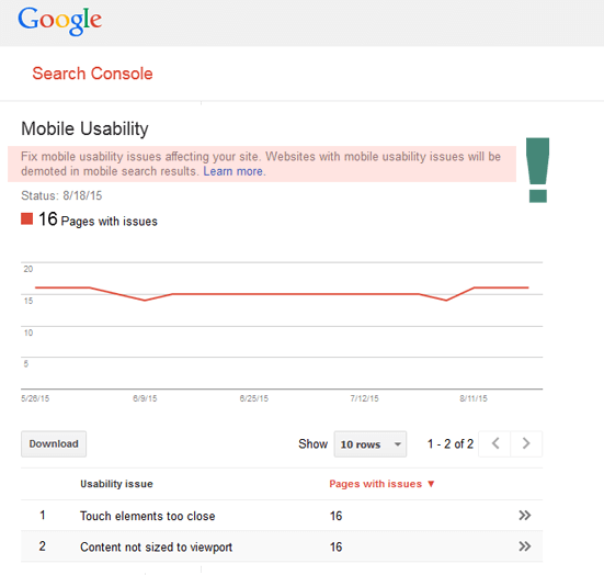
In the above image, you can see that Google clearly states that websites with mobile usability issues will be demoted in the search results. That ain’t good. The saving grace is that Google shows you exactly what pages are broken, and how to fix them. In this case its a few quick fixes and the website is fixed.
We recommend checking Google Search Console every week to make sure there aren’t any glaring issues. If you have a very important site you can set up alerts as well.
Last updated April 2026